原创作品,允许转载,转载时请务必以超链接形式标明文章 原始出处 、作者信息和本声明。否则将追究法律责任。http://kofi1122.blog.51cto.com/2815761/521605
本人在美工方面一直是比较白痴的,对于一些颜色什么乱七八糟的非常头痛,但是在Android编程中这又是经常涉及到的东西,没办法,只有硬着头皮上。
Android中常常使用shape来定义控件的一些显示属性,今天看了一些shape的使用,对shape有了大体的了解,稍作总结:
先看下面的代码:
<shape>
<!-- 实心 -->
<solid android:color="#ff9d77"/>
<!-- 渐变 -->
<gradient
android:startColor="#ff8c00"
android:endColor="#FFFFFF"
android:angle="270" />
<!-- 描边 -->
<stroke
android:width="2dp"
android:color="#dcdcdc" />
<!-- 圆角 -->
<corners
android:radius="2dp" />
<padding
android:left="10dp"
android:top="10dp"
android:right="10dp"
android:bottom="10dp" />
</shape>
solid:实心,就是填充的意思 android:color指定填充的颜色
gradient:渐变
android:startColor和android:endColor分别为起始和结束颜色,ndroid:angle是渐变角度,必须为45的整数倍。
另外渐变默认的模式为android:type="linear",即线性渐变,可以指定渐变为径向渐变,android:type="radial",径向渐变需要指定半径android:gradientRadius="50"。
stroke:描边
android:width="2dp" 描边的宽度,android:color 描边的颜色。
我们还可以把描边弄成虚线的形式,设置方式为:
android:dashWidth="5dp"
android:dashGap="3dp"
其中android:dashWidth表示'-'这样一个横线的宽度,android:dashGap表示之间隔开的距离。
corners:圆角
android:radius为角的弧度,值越大角越圆。
我们还可以把四个角设定成不同的角度,方法为:
<corners
android:topRightRadius="20dp" 右上角
android:bottomLeftRadius="20dp" 右下角
android:topLeftRadius="1dp" 左上角
android:bottomRightRadius="0dp" 左下角
/>
这里有个地方需要注意,bottomLeftRadius是右下角,而不是左下角,这个有点郁闷,不过不影响使用,记得别搞错了就行。
还有网上看到有人说设置成0dp无效,不过我在测试中发现是可以的,我用的是2.2,可能修复了这个问题吧,如果无效的话那就只能设成1dp了。
padding:间隔
这个就不用多说了,XML布局文件中经常用到。
大体的就是这样,以下是一个使用的具体示例:用在Selector中作为Button的背景,分别定义了按钮的一般状态、获得焦点状态和按下时的状态,具体代码如下:
main.xml:
<Button
android:layout_width="wrap_content"
android:layout_height="wrap_content"
android:text="TestShapeButton"
android:background="@drawable/button_selector"
/>
button_selector.xml:
<?xml version="1.0" encoding="utf-8"?>
<selector
xmlns:android="http://schemas.android.com/apk/res/android">
<item android:state_pressed="true" >
<shape>
<!-- 渐变 -->
<gradient
android:startColor="#ff8c00"
android:endColor="#FFFFFF"
android:type="radial"
android:gradientRadius="50" />
<!-- 描边 -->
<stroke
android:width="2dp"
android:color="#dcdcdc"
android:dashWidth="5dp"
android:dashGap="3dp" />
<!-- 圆角 -->
<corners
android:radius="2dp" />
<padding
android:left="10dp"
android:top="10dp"
android:right="10dp"
android:bottom="10dp" />
</shape>
</item>
<item android:state_focused="true" >
<shape>
<gradient
android:startColor="#ffc2b7"
android:endColor="#ffc2b7"
android:angle="270" />
<stroke
android:width="2dp"
android:color="#dcdcdc" />
<corners
android:radius="2dp" />
<padding
android:left="10dp"
android:top="10dp"
android:right="10dp"
android:bottom="10dp" />
</shape>
</item>
<item>
<shape>
<solid android:color="#ff9d77"/>
<stroke
android:width="2dp"
android:color="#fad3cf" />
<corners
android:topRightRadius="5dp"
android:bottomLeftRadius="5dp"
android:topLeftRadius="0dp"
android:bottomRightRadius="0dp"
/>
<padding
android:left="10dp"
android:top="10dp"
android:right="10dp"
android:bottom="10dp" />
</shape>
</item>
</selector>
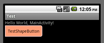
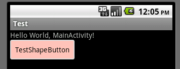
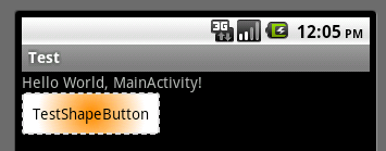
运行效果如下图:
一般状态:
获得焦点状态:
按下状态:
本文出自 “Kofi” 博客,请务必保留此出处http://kofi1122.blog.51cto.com/2815761/521605
本文链接:https://www.it72.com/10106.htm
 阿里云再次搬迁笔记
 利用Internet Download Manager下载Google云盘大文件
 Linux查看进程及相关操作常用命令
 5G:无线网络的未来?
 免费xiuno博客主题【最后更新:2019.5.20】
 Run-Time Check Failure #0 - The value of ESP was not properly saved across a function call. This is
 IDEA创建SpringBoot项目详细步骤
 C++实现NAT检测程序
 easypoi快捷表格框架使用
 Xposed框架的使用
 安卓准备向手机厂商收费?
 解决SSH连接问题packet too long 1349676920
 Android 8.0应用图标适配