直接上源码
package com.androiddemo;
import android.content.Context;
import android.content.res.TypedArray;
import android.graphics.Canvas;
import android.graphics.Color;
import android.graphics.Paint;
import android.graphics.RectF;
import android.util.AttributeSet;
import android.util.TypedValue;
import android.view.View;
public class CustomProgressBar extends View implements Runnable {
	private int mFirstColor;// 第一圈的颜色
	private int mSecondColor;// 第二圈的颜色
	private int mCircleWidth;// 圈的宽度
	private Paint mPaint;// 画笔
	private int mProgress;// 当前进度
	private int mSpeed;// 速度
	private boolean isNext;// 是否应该开始下一个
	private float centre; // 获取圆心的x坐标
	private float radius;// 半径
	private RectF oval;
	public CustomProgressBar(Context context, AttributeSet attrs) {
		this(context, attrs, 0);
		// 绘图线程
		new Thread(this).start();
	}
	/**
	 * 必要的初始化,获得一些自定义的值
	 *
	 * @param context
	 * @param attrs
	 * @param defStyle
	 */
	public CustomProgressBar(Context context, AttributeSet attrs, int defStyle) {
		super(context, attrs, defStyle);
		TypedArray a = context.obtainStyledAttributes(attrs,
				R.styleable.CustomProgressBar, defStyle, 0);
		int n = a.getIndexCount();
		for (int i = 0; i < n; i++) {
			int attr = a.getIndex(i);
			switch (attr) {
			case R.styleable.CustomProgressBar_firstColor:
				mFirstColor = a.getColor(attr, Color.GREEN);
				break;
			case R.styleable.CustomProgressBar_secondColor:
				mSecondColor = a.getColor(attr, Color.RED);
				break;
			case R.styleable.CustomProgressBar_circleWidth:
				mCircleWidth = a.getDimensionPixelSize(attr, (int) TypedValue
						.applyDimension(TypedValue.COMPLEX_UNIT_PX, 20,
								getResources().getDisplayMetrics()));
				break;
			case R.styleable.CustomProgressBar_speed:
				mSpeed = a.getInt(attr, 20);// 默认20
				break;
			}
		}
		a.recycle();
		mPaint = new Paint(Paint.ANTI_ALIAS_FLAG);
	}
	@Override
	protected void onLayout(boolean changed, int left, int top, int right,
			int bottom) {
		// TODO Auto-generated method stub
		super.onLayout(changed, left, top, right, bottom);
		if (centre == 0) {
			centre = getWidth() / 2; // 获取圆心的x坐标
			radius = centre - mCircleWidth / 2;// 半径
			oval = new RectF(centre - radius, centre - radius, centre + radius,
					centre + radius); // 用于定义的圆弧的形状和大小的界限
		}
	}
	@Override
	protected void onDraw(Canvas canvas) {
		mPaint.setStrokeWidth(mCircleWidth); // 设置圆环的宽度
		mPaint.setStyle(Paint.Style.STROKE); // 设置空心
		if (!isNext) {// 第一颜色的圈完整,第二颜色跑
			mPaint.setColor(mFirstColor); // 设置圆环的颜色
			canvas.drawCircle(centre, centre, radius, mPaint); // 画出圆环
			mPaint.setColor(mSecondColor); // 设置圆环的颜色
			canvas.drawArc(oval, -90, mProgress, false, mPaint); // 根据进度画圆弧
		} else {
			mPaint.setColor(mSecondColor); // 设置圆环的颜色
			canvas.drawCircle(centre, centre, radius, mPaint); // 画出圆环
			mPaint.setColor(mFirstColor); // 设置圆环的颜色
			canvas.drawArc(oval, -90, mProgress, false, mPaint); // 根据进度画圆弧
		}
	}
	@Override
	public void run() {
		// TODO Auto-generated method stub
		while (true) {
			mProgress++;
			if (mProgress == 360) {
				mProgress = 0;
				isNext = !isNext;
			}
			postInvalidate();
			try {
				Thread.sleep(mSpeed);
			} catch (InterruptedException e) {
				e.printStackTrace();
			}
		}
	}
}
attrs.xml
<?xml version="1.0" encoding="utf-8"?>
<resources>
    <attr name="firstColor" format="color" />
    <attr name="secondColor" format="color" />
    <attr name="circleWidth" format="dimension" />
    <attr name="speed" format="integer" />
    <declare-styleable name="CustomProgressBar">
        <attr name="firstColor" />
        <attr name="secondColor" />
        <attr name="circleWidth" />
        <attr name="speed" />
    </declare-styleable>
</resources>
布局文件
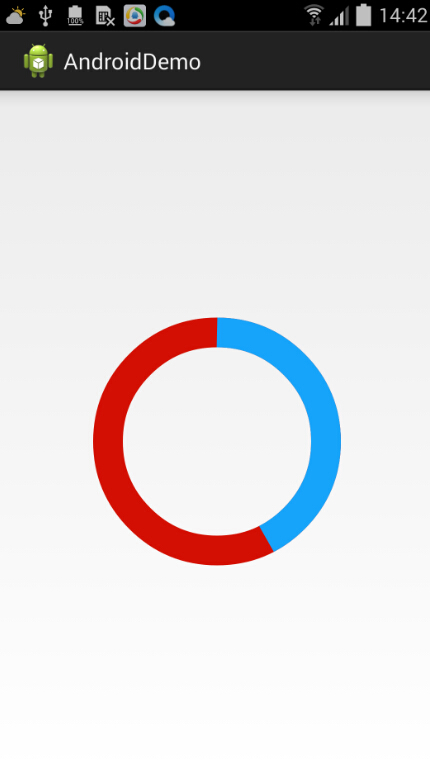
<RelativeLayout xmlns:android="http://schemas.android.com/apk/res/android"
    xmlns:tools="http://schemas.android.com/tools"
    xmlns:mand="http://schemas.android.com/apk/res/com.androiddemo"
    android:layout_width="match_parent"
    android:layout_height="match_parent"
    tools:context=".MainActivity" >
    <com.androiddemo.CustomProgressBar
        android:layout_width="200dp"
        android:layout_height="200dp"
        android:layout_centerInParent="true"
        android:layout_marginBottom="40dp"
        mand:circleWidth="24dp"
        mand:firstColor="#16A3FA"
        mand:secondColor="#D20F02"
        mand:speed="2" />
</RelativeLayout>
本文链接:https://www.it72.com/1157.htm
 阿里云再次搬迁笔记
 利用Internet Download Manager下载Google云盘大文件
 Linux查看进程及相关操作常用命令
 5G:无线网络的未来?
 免费xiuno博客主题【最后更新:2019.5.20】
 Run-Time Check Failure #0 - The value of ESP was not properly saved across a function call. This is
 IDEA创建SpringBoot项目详细步骤
 C++实现NAT检测程序
 easypoi快捷表格框架使用
 Xposed框架的使用
 安卓准备向手机厂商收费?
 解决SSH连接问题packet too long 1349676920
 Android 8.0应用图标适配