在本文中,我们将使用bootstrap 4卡类来实现毛玻璃效果。
方法:
1.样式设置主体:首先,为您的网页设置背景。将以下代码写在<style>标记内的head标记下。如果您已经设置了背景属性(您将拥有),那么请跳到下一部分。如果不是,请继续。
的CSS
body {
     background-image: url('background.jpg');
     background-repeat: no-repeat;
     background-size: 100%;
     background-attachment: fixed;
}
2.霜玻璃卡:在样式标签下,使用以下代码,
的CSS
.card {
      box-shadow: 0 0 5px 0 ;
      background: inherit;
      backdrop-filter: blur(10px);
      <!--margin: 100px; according to your need-->
}
那我们这里有什么
box-shadow:此属性用于为元素的框架提供类似阴影的效果。
背景:使用它可以使元素透明并具有与网页相同的背景(在主体类中,必须具有“背景固定:固定”)
背景过滤器:使用此选项可将效果应用于元素后面的区域。(也请阅读)基本上,这是在此处减少许多CSS样式的属性。
保证金:保证金和填充根据您的需要。
注意: Mozilla的浏览器Firefox出现问题,并且在某些情况下,背景幕过滤器无法正常工作,Chrome和Edge可以正常工作。
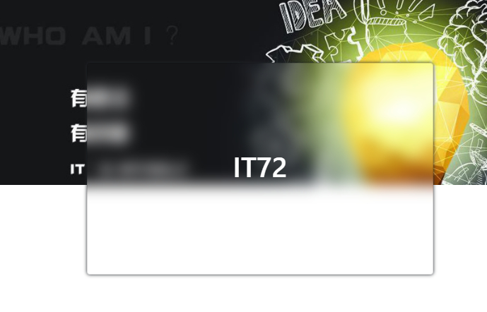
3.最终代码HTML
<!DOCTYPE html>
<html>

<head>
    <link rel="stylesheet" href="https://res.it72.com/view/css/bootstrap.css?1.3.3.0">

    <style>
        body {
            background-image: url("./banner02.jpg");
            background-repeat: no-repeat;
            background-size: 100%;
            background-attachment: fixed;
        }

        h1 {
            color: white;
            height: 250px;
            display: flex;
            justify-content: center;
            align-items: center;
        }

        .card {
            top: 50%;
            box-shadow: 0 0 5px 0;
            background: inherit;
            backdrop-filter: blur(10px);
            margin: 100px;
            text-align: center;
        }
    </style>
</head>

<body>

    <div>
        <div class="card card-body"
            style="justify-content: center;">
            <h1>IT72</h1>
        </div>
    </div>
</body>

</html>
本文链接:https://www.it72.com/12676.htm
 解决安卓运行错误Error:Execution failed for task ':app:transformDexArchiveWithExternalLibsDexMergerForDebug
 Swift标准类库,相当于一些C ++里的STL类库
 软件测试教程:如何执行测试
 Java中的(耦合)控制反转
 win10利用winsat disk测试磁盘读写速度
 Android布局嵌套太多层会Crash
 不要错过的9.0高分催泪国漫《白蛇:缘起》
 如何精简化Xposed
 Thinkpad X1隐士 风扇声音过大的解决方法
 vs2017编译和使用libcurl库
 Thinkpad x1 Extreme黑苹果10.14.5安装完成
 Xposed框架的使用
 虚拟内存现在还有用吗?