最近在使用知乎Android客户端的时候发现一个十分好玩的UI。如下图:
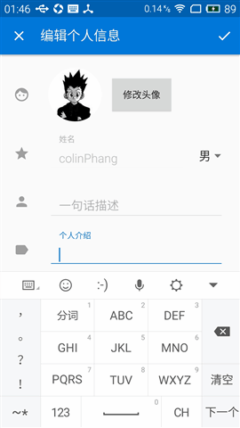
图1
其实不难看出,知乎app使用了大量原生的Android Material Design控件,包括ToolBar、DrawerLayout、NavigationView、CardView、SwipeRefreshLayout、FloatingActionButton、BottomNavigationBar等等等等。
顺着这个思路,我很快找到上图这个EditText获取到焦点后,hint文本的动画效果实际上也是来源于Material Design库中的一个控件—— TextInputLayout 。下面简单介绍一下这个控件的用法以及用途。
1 使用
1.1 添加库依赖
要使用这个控件,需要引入 appcompat-v7 以及 Design Support Library 两个库。
dependencies {
    compile 'com.android.support:appcompat-v7:23.1.1'
    compile 'com.android.support:design:23.1.1'
}
1.2 布局中的使用
首先我们必须了解的是, TextInputLayout 继承于 LinearLayout ,只能拥有一个直接的ChildView(类似于 ScrollView ),且这个ChildView只能是 EditText 。
<android.support.design.widget.TextInputLayout
        android:layout_width="match_parent"
        android:layout_height="wrap_content">
        <EditText
            android:id="@+id/edt_password"
            android:layout_width="match_parent"
            android:layout_height="wrap_content"
            android:hint="password"/>
    </android.support.design.widget.TextInputLayout>
一般来说, EditText 有一个 hint 属性,当 Edittext 中没有内容时,就会显示文字提示。一旦用户开始输入时,这个文字提示就会消失,取而代之地显示用户的输入。这样有一个坏处就是用户就无法了解到当前自己输入的是关于什么的信息。
而TextInputLayout解决了这个问题,用户开始输入时, hint 文字提示会变成 EditText 上方的标签,并伴随一个向上平移+缩放的优雅动画。
就这样,就可以实现图1的效果。
1.3 其他
- Google将 Design Support Library 设计得尽善尽美。库中每个控件的设计颜色都来自 style.xml 中 theme 指定的各种颜色。在工程应用的主题中,修改 colorAccent 属性便可以指定 TextInputLayout 的标签字体颜色以及 EditText 的下划线颜色。
<style name="AppTheme" parent="Theme.AppCompat.Light.NoActionBar">
 <item name="colorAccent">#3498db</item>
</style>
-
实际项目中,我们需要对用户的输入进行校验(例如 邮箱格式、密码长度、手机号码等),对用户的输入(即 mTextInputLayout.getEditText().getText().toString() )在后台进行验证,如果检查到用户输入不合法,可以通过 setError() 显示输入错误提示,以及 setErrorEnabled(fasle) 清除错误提示。
public void onClick(View v) {
 hideKeyboard();
 String username = usernameWrapper.getEditText().getText().toString();
 String password = usernameWrapper.getEditText().getText().toString();
 if (!validateEmail(username)) {
     usernameWrapper.setError("Not a valid email address!");
 } else if (!validatePassword(password)) {
     passwordWrapper.setError("Not a valid password!");
 } else {
     usernameWrapper.setErrorEnabled(false);
     passwordWrapper.setErrorEnabled(false);
     doLogin();
 }
}
`
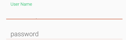
正常状态.png
错误提示的效果是:标签字体颜色变红,且在EditText下方出现错误信息的标签,这时整个TextInputLayout的高度也会发生变化。如下图:
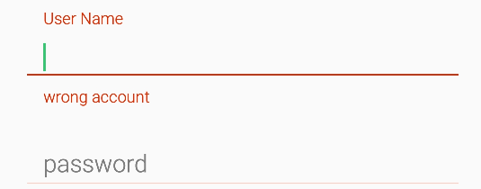
错误提示.png
2 内部实现
/**
 * Layout which wraps an {@link android.widget.EditText} (or descendant) to show a floating label
 * when the hint is hidden due to the user inputting text.
 *
 * Also supports showing an error via {@link #setErrorEnabled(boolean)} and
 * {@link #setError(CharSequence)}.
 */
public class TextInputLayout extends LinearLayout {
      ......
    @Override
    public void addView(View child, int index, ViewGroup.LayoutParams params) {
        if (child instanceof EditText) {
            setEditText((EditText) child);
            super.addView(child, 0, updateEditTextMargin(params));
        } else {
            // Carry on adding the View...
            super.addView(child, index, params);
        }
    }
   private void setEditText(EditText editText) {
// Add a TextWatcher so that we know when the text input has changed
        mEditText.addTextChangedListener(new TextWatcher() {
            @Override
            public void afterTextChanged(Editable s) {
                updateLabelVisibility(true);
                if (mCounterEnabled) {
                    updateCounter(s.length());
                }
            }
            @Override
            public void beforeTextChanged(CharSequence s, int start, int count, int after) {}
            @Override
            public void onTextChanged(CharSequence s, int start, int before, int count) {}
        });
      ......
}
  }
可以看出,TextInputLayout为内部的EditText设置了一个监听器,监听到有文本输入的时候,通过 updateLabelVisibility(true); 将EditText的hint转变成上方的标签。
private void updateLabelVisibility(boolean animate) {
......
        if (hasText || isFocused || isErrorShowing) {
            // We should be showing the label so do so if it isn't already
            collapseHint(animate);
        } else {
            // We should not be showing the label so hide it
             expandHint(animate);
        }
}
而在 collapseHint(boolean animate) 和 expandHint(boolean animate) 内部都是执行 animateToExpansionFraction(final float target) 方法,通过属性动画来控制TextInputLayout里面EditText上方hint标签的显示。
private void animateToExpansionFraction(final float target) {
......
        mAnimator.setFloatValues(mCollapsingTextHelper.getExpansionFraction(), target);
        mAnimator.start();
    }
3 Conclusion
TextInputLayout的简单使用,是Google推出的整个Material Design库的一个缩影:Google将UI视觉效果设计得华丽且流畅,同时代码封装更为优雅,开发者只需要在layout.xml中写好布局文件,就可以轻松在手机屏幕上展现出魔法般的动画效果,实在是妙不可言。
来自:http://www.jianshu.com/p/dad372912dd5
- 文章2303
- 用户1336
- 访客11119022
汗水是成功的润滑剂。